
Educational game · Hackathon · 2025
Matura, Please!
A browser game designed by four students during a two-day TU Graz hackathon to make mathematics exam preparation more fun and engaging.
- Role
- UI/UX design
- Year
- 2025
- Team
- Four students
- Tools
- Canva, Unity, Game design
- Prototype
- Play the browser game ↗
Context
Matura, Please! was created during a two-day hackathon at TU Graz, organised around open educational resources and supported by edventure Studios. The challenge was to build an open educational game that could help young people learn difficult concepts in STEM subjects.
Our team of four students focused on preparation for Austria’s mathematics Matura. With only two days to move from the brief to a playable Unity game, the interface had to be clear, visually coherent and realistic for the developers to implement within the event. I was responsible for the UI/UX design and worked with the developers to define an interface that could be produced quickly in Canva and implemented in Unity during the hackathon.
01 — Scope the game
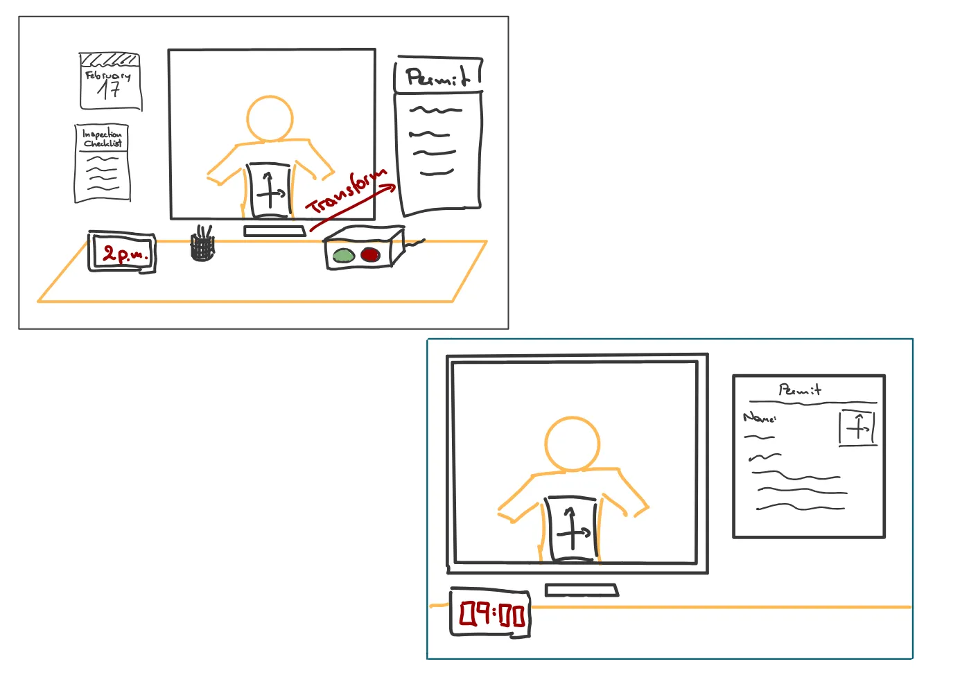
The brainstorming phase was all about coming up with a game concept that would be fun and engaging for students. The result: a game concept that combines elements of the games “Papers, please!” and “You are not my neighbor”: The player works in an office-like setting, checks mathematical functions against their proposed attributes, and accepts or rejects each submission depending on whether the description is correct.
We wrote down our requirements and ideas and divided them into 3 different categoris: must, should and could. This gave the team a practical outline for the two days and helped protect the central gameplay loop from optional ideas. Once we had agreed on the office-based concept, I identified the key interface elements used by comparable games and drafted the first UI components. The early prototype stayed deliberately minimal so the team could establish the flow before investing time in polished assets.
02 — Game screen design
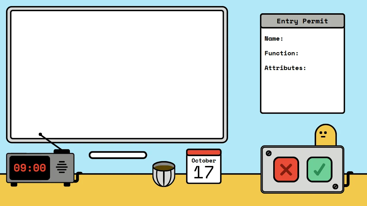
I created the main game screen in Canva, with the goal of making it straightforward to reproduce in Unity. The direction drew on the smooth colour palette and comic-like visual language of Mini Motorways. The desk, paperwork, controls, and mathematical prompt form one compact workspace, keeping the decision in focus.
03 — Bulding a reusable UI kit
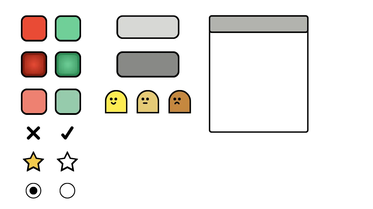
I designed the supporting interface as a small, consistent system rather than a collection of isolated screens. It included interactive buttons with two or three states, the environmental background, and smaller objects needed throughout the game.
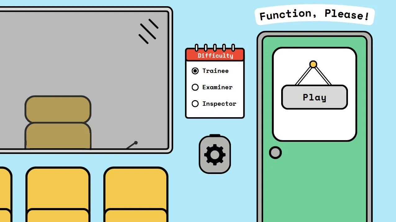
The home screen presents difficulty selection as part of the game world. An exterior view of the office acts as the starting point, while settings and difficulty controls sit within the same visual language rather than feeling like a separate utility screen.
04 — The feedback loop
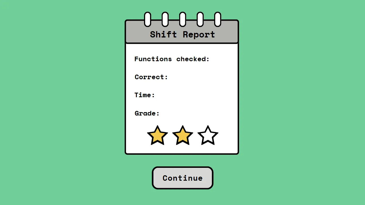
The end-of-round report card gives the player performance feedback through a small set of metrics and a three-star rating. This closes the loop between answering questions and understanding the result without introducing another visually unrelated screen.
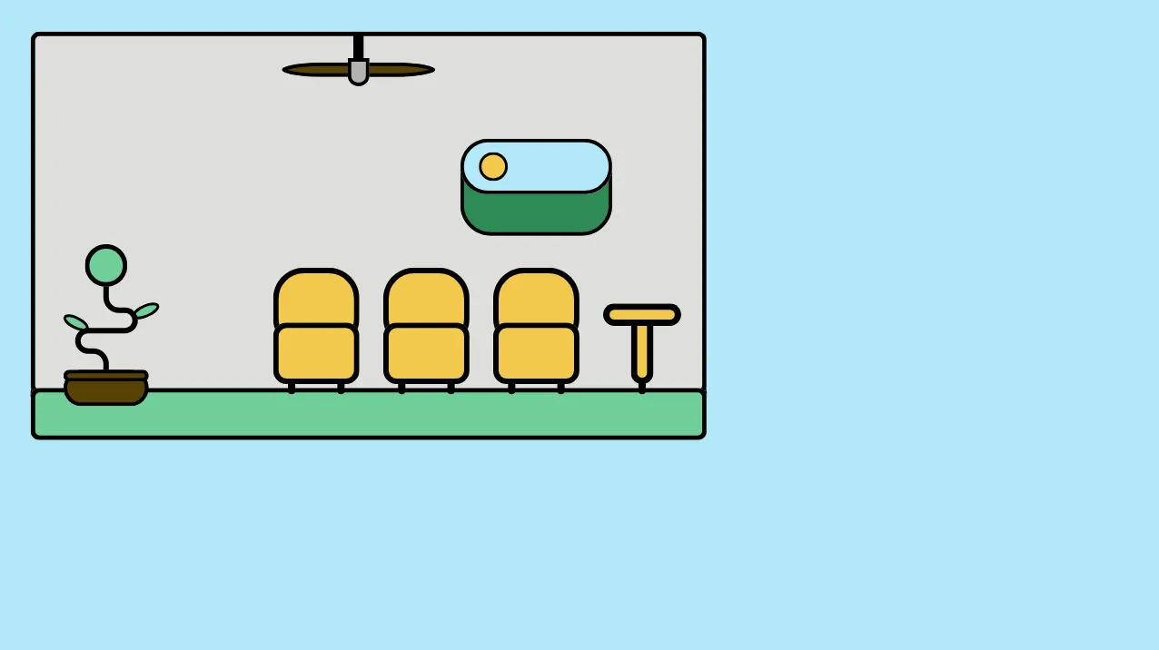
For the view behind the game window, I drew a waiting-room setting with chairs, a ceiling fan, and a plant. In the implemented game this scene is blurred, adding atmosphere while keeping the interactive task visually dominant.
Lessons learned
The team completed a playable browser game during the two-day event. The result translates mathematics practice into a clear accept-or-reject loop and gives the experience a coherent identity across gameplay, navigation, difficulty selection and feedback.
The strongest lesson was that a short deadline makes prioritisation part of the design work. Defining must, should, and could requirements early gave us a stable target. Reusable elements reduced duplicated effort and continuous communication kept the visual direction compatible with the Unity implementation.