
Product design case study · 2024
DocPit
A product-design project aimed at Austrian practitioners, evaluated with a user study.
- Role
- UX research and product design
- Year
- 2024
- Tools
- Adobe XD, Maze, User study
- Prototype
- View original presentation ↗
Context
DocPit began as a response to a practical healthcare problem: doctors need to spend their limited time with patients, yet the software around that work can be dated, cluttered and difficult to adapt. The concept explored how a clearer, more efficient platform could support healthcare professionals in Austrian medical practices.
This was a product-design project rather than a production healthcare system. The work moved from exploratory interviews to a high-fidelity prototype and an unmoderated usability study.
The problem
With only about 264 hospitals and over 54,810 doctors in 2022 and numbers still increasing, Austria is experiencing a shortage of doctors — but why? An aging population, the simultaneous retirement of the “baby boomer” generation and COVID-19 have had an impact on both the supply and demand sides of the supply system in Austria. All these factors happen to increase the importance of well-spent, focused time on what is really important — their patients. Old, out-dated and cluttered software is hindering doctors all over Austria to do exactly that.
The early research focused on recurring sources of friction: interfaces that lacked clarity, workflows split across software, phone, email, and messaging, and limited options for adapting tools to an individual practice. Those observations led to a product direction centred on speed, reliability, a clear information hierarchy, and customisable workflows.
My role and process
I owned the case study across five stages: interviewing potential users, synthesising the research, defining a representative persona and business model, exploring ideas, prototyping the interface, and preparing and running remote usability evaluation.
The process was deliberately iterative. Each stage narrowed the problem before more time was invested in interface detail.
01 — Empathise
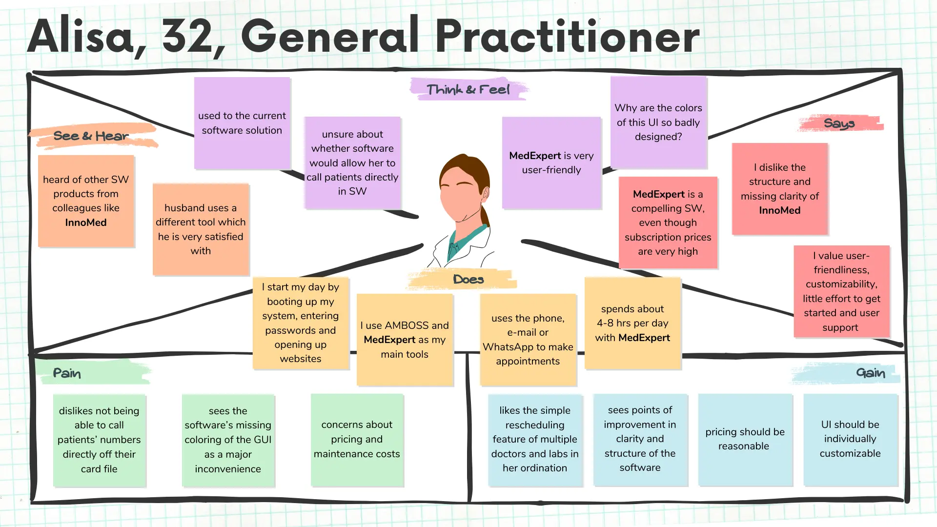
This stage was cruicial to gain an empathetic understanding of the problem through user research by conducting ivterviews with potential users.
Trying to represent Austrian statistics, my interview pool consisted of 1 female and 4 male white Austrian doctors between the ages of 30 and 40. Through carefully crafted survey questions I was able to create empathy maps of each individual and extract key features to consider.
02 — Define
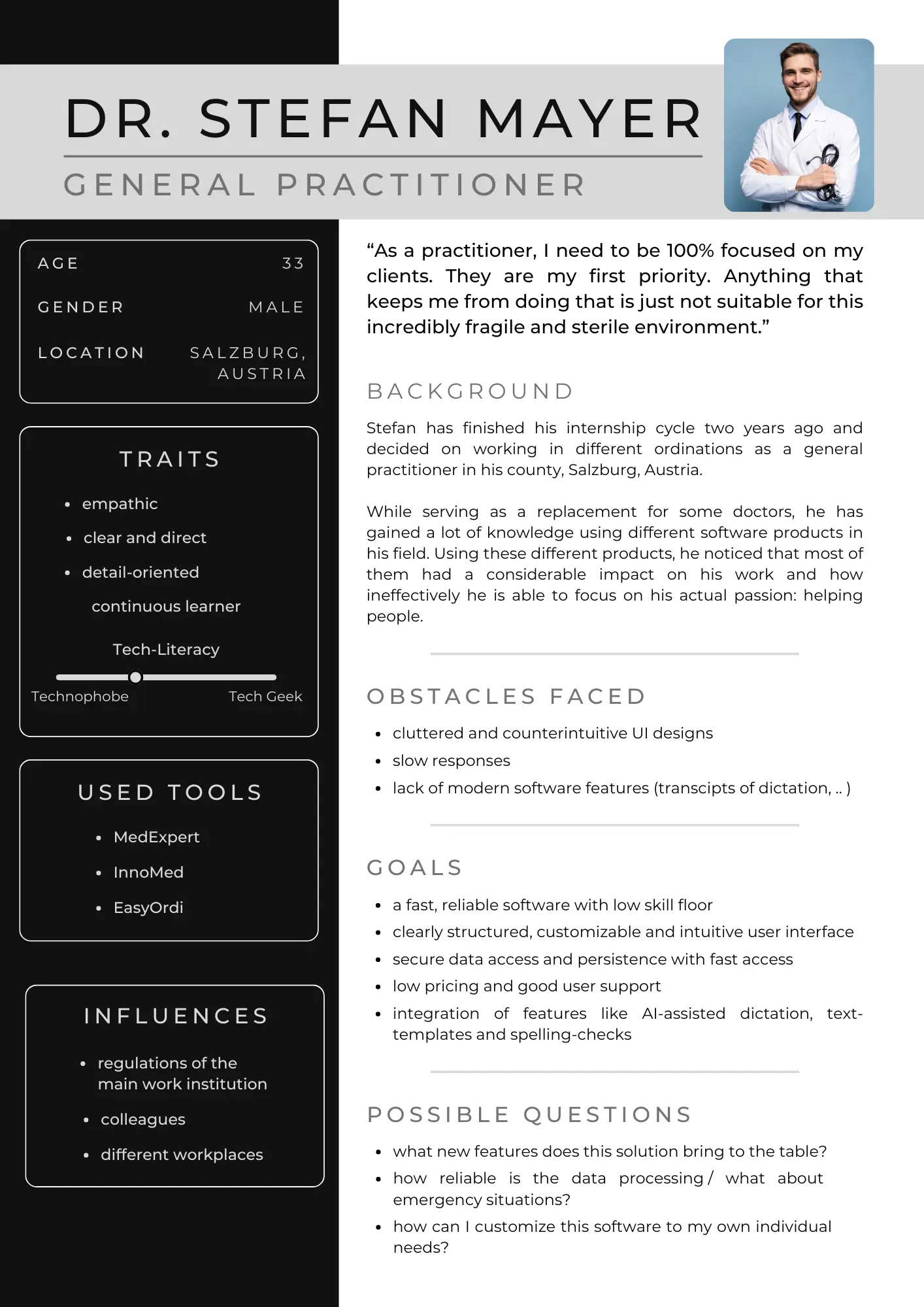
Accumulating the information gathered and analyzing my observations I crafted a Persona including the core problems to keep my efforts human-centered before proceeding to ideation.
I investigated the individual answers of the interviewees and extracted common points of views and keywords out of the created Empathy maps. Choosing the individual features of the persona took some effort, due to minor differences in needs and the lack of flexibility due to the institution they work at.
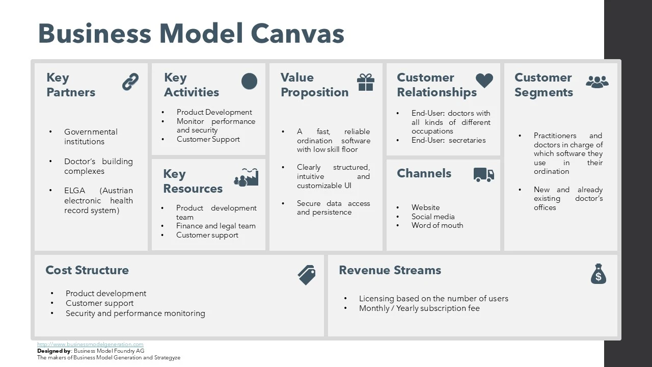
Alongside the user perspective, I created a Business Model Canvas to visually and strategically outline a potential business model. It provides a comprehensive framework to understand, analyze and improve the prospective core components.
03 — Ideate
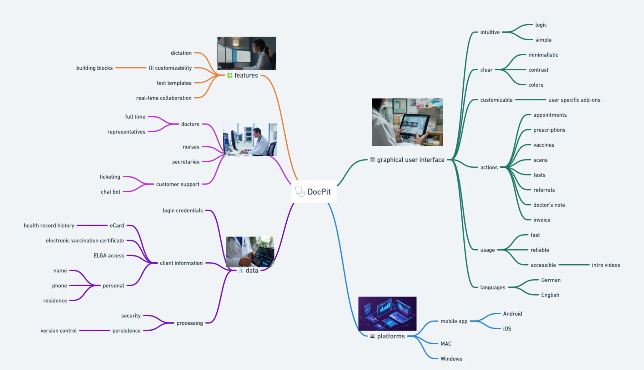
Due to the solid background knowledge gained from the first two phases it was time to “think outside the box”. Looking for alternative ways to view the problem and identify innovative solutions I decided to apply Mind Mapping as my brainstorming method to find new ideas.
Due to the simple, create design of a Mind Map, I could easily visualize all of my thoughts and comments in one single graphic. Breaking apart different parts of the app made me focus a lot more on the specifics and edge cases I have to consider.
04 — Prototype
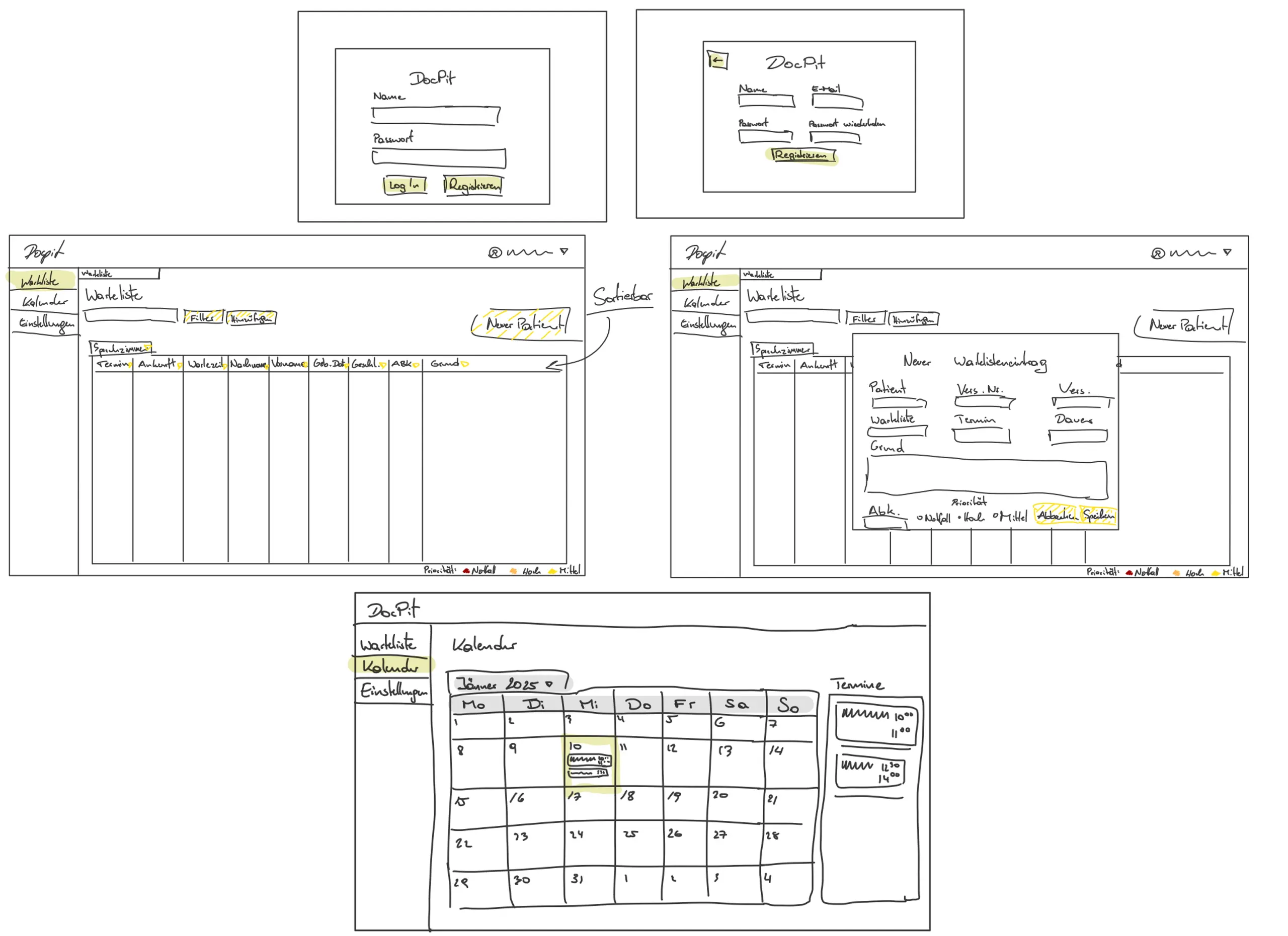
I started with low-fidelity flows for registration, a patient waiting list, adding a patient and a calendar. Working at low fidelity made it inexpensive to compare layouts and reconsider the navigation and information density.
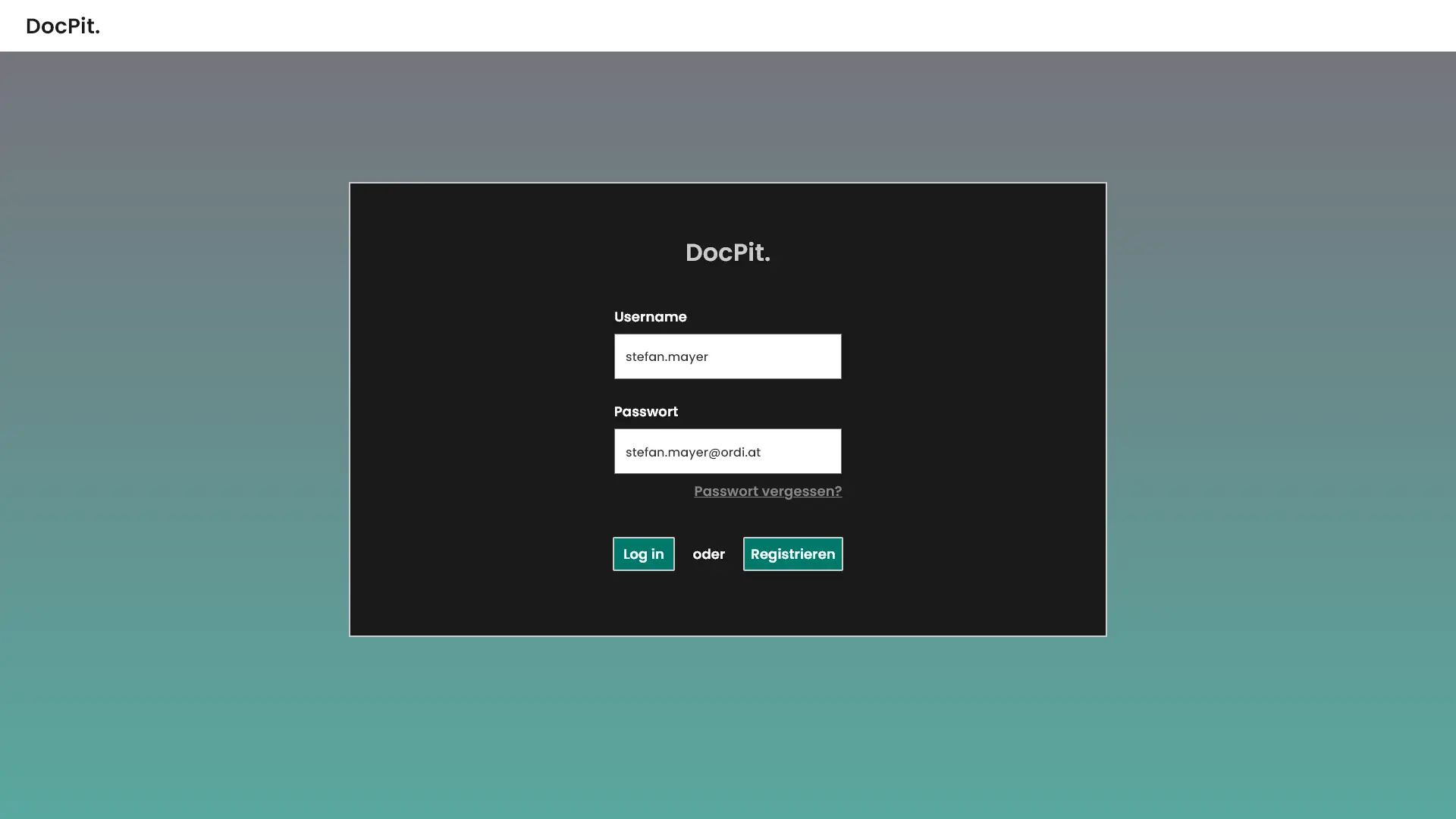
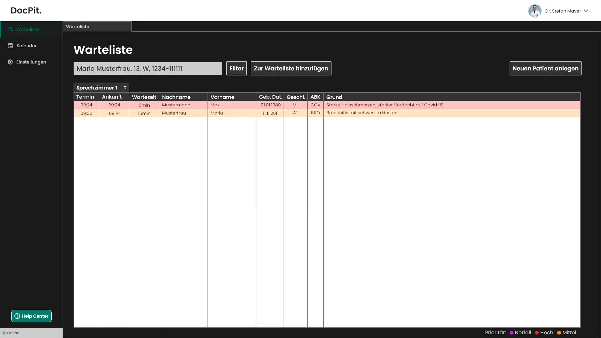
I then developed the concept in Adobe XD. The high-fidelity prototype used a persistent navigation rail and a table-led waiting-list view so frequently needed information remained visible at a glance. Colour-coded priority states distinguished emergencies and different urgency levels within the queue.
05 — Testing
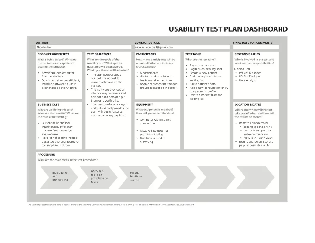
Once the high-fidelity prototype was ready, I created a usability test plan for five participants. The remote, unmoderated study used Maze for prototype tasks and a separate survey for qualitative feedback.
The planned task set covered account creation and login, creating a patient, adding a patient to the waiting list, editing patient details, adding a consultation entry and deleting a patient. This tested complete workflows rather than asking participants for reactions to isolated screens.
Lessons learned
Interface simplification starts before interface design. Interviews exposed fragmented workflows, synthesis turned them into priorities and low-fidelity exploration made it possible to test the product structure before polishing it. The next iteration should broaden the participant sample and examine accessibility and integration constraints in greater depth.